Imagev3
Image allows a single image asset to be displayed on the page. Images are adaptive; the relevant image width is selected for the screen size and lazy loading is available.
Examples
Standard
Simple image with an asset referenced from DAM and no other configuration. By default, metadata for the asset (alternative text and caption) is read from DAM but can also be provided by an author.

- Properties
- Markup
- JSON
- fileReference: /content/dam/core-components-examples/library/sample-assets/lava-into-ocean.jpg
- displayPopupTitle: true
- titleValueFromDAM: true
- sling:resourceType: core-components-examples/components/image
- isDecorative: false
- altValueFromDAM: true

Caption
Captions are displayed by default in a pop-up on hover but the image can also be configured so that the caption is displayed directly on the page.
 Lava flowing into the ocean
- Properties
- Markup
- JSON
- fileReference: /content/dam/core-components-examples/library/sample-assets/lava-into-ocean.jpg
- displayPopupTitle: false
- titleValueFromDAM: true
- sling:resourceType: core-components-examples/components/image
- isDecorative: false
- altValueFromDAM: true
 Lava flowing into the ocean
Linked
Images can be linked to internal relative AEM resources or to external absolute URLs.
- Properties
- Markup
- JSON
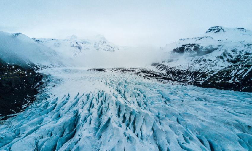
- fileReference: /content/dam/core-components-examples/library/sample-assets/snowy-mountain-glacier.jpg
- linkURL: /content/core-components-examples/library/core-content/image
- displayPopupTitle: true
- titleValueFromDAM: true
- sling:resourceType: core-components-examples/components/image
- isDecorative: false
- altValueFromDAM: true
SVG and GIF Images
SVG and GIF image MIME types are supported.

- Properties
- Markup
- JSON
- fileReference: /content/dam/core-components-examples/library/components/component.svg
- displayPopupTitle: true
- titleValueFromDAM: true
- sling:resourceType: core-components-examples/components/image
- isDecorative: false
- altValueFromDAM: true

Empty Image
An empty image component renders the featured image defined for the page.


